
Dear reader,
Today’s topic really is a controversial one. Or is it? Certainly in the discussions online, there is a sizeable minority, either of genuine architects or fans of their ilk, who support modern architecture, and scoff at any attempt to recreate the styles of the past. But they are, I will argue, in the minority.
I think it is important to remember that what we might term “modern” architecture is a bit older than most people think. Certainly it can trace its roots to the Bauhaus movement of the 1920s, and in some cases even earlier. The trend for large sheets of glass on buildings began much earlier, in fact the first buildings constructed in this manner were in the Victorian era (though it is true that at the time the practice was far from common and widely derided).
Many would say that the rise of bad architecture really was in the 1950s and 1960s. It is obvious that during this period, many quite horrifically ugly buildings were put up. Bare concrete looks can look an attractive off-white when first applied, but alas, it water stains badly, and besides, the ugly geometric shapes did little to enhance the appeal of such buildings.
One of the aesthetic horrors of this period was pebbledash. Large panels filled with stones, while vaguely reminiscent of a shingle beach, looked very bad indeed on flat, boring panels. I suppose at the very least, the attempt to use natural patterns was welcome.
But a lot of people are prepared to give any building that isn’t concrete a free pass, no matter how ugly or downright insulting it is. Many large buildings are now constructed using a steel frame, onto which large, flat panels (usually either glass or some god awful cladding) are placed mounted.
I do not dispute that this is an effective building method; it is far easier and quicker than most other methods, and allows pre-fabrication of virtually everything before it arrives on site. Coupled with modern surveying methods, this allows for astounding levels of precision in construction (I was taught, for example, that being even 5 mm out is often unacceptable).
I also do not dispute that glass is useful; natural light is good for you, and can often reduce the energy use of the building. Depending on the location, the view can also be quite the advantage too.
Unfortunately, while these buildings are quick and effective to construct, and quite light, they have the enormous disadvantage of being universally terrible to look at. Modern “architects” seem to have got it into their heads that the only appropriate shape for a building is a geometric one. Detailing has become something of a lost art; the modern fashion is minimalism; of showing off clean, uninterrupted lines, or, in real terms, showing off nothing, displaying nothing but a cold reflection.
Ah you may say, does this not also make the building cheaper? The answer is neither yes nor no. It is true that traditional buildings require craftspeople who need to be paid. Stonemasons in particular can be very pricey, but this is partly as a result of the fact that there are very few of them; one cannot escape the laws of supply and demand.
However, one underestimates the level of craftmanship that goes into minimal buildings. The extreme precision I talked about earlier is in fact essential if these buildings are to look as they are supposed to. There can be no scruffy joints between ceilings and floors, for example, because there are no skirting boards to cover this up, necessitating skilled (and therefore expensive) plasterwork. Each panel has to fit perfectly because there are no details to cover up some small imperfection, and therefore the engineering standards required are so much higher. For these reasons, I would object to the idea that buildings have to look boring because we cannot afford anything else.
All this is a form of preamble, to give some general points and background. Now I must make the point that inspired me to write this article.
The simple idea is this; most people vastly prefer traditional architecture to the modern alternatives. People flock to see the beauty of Paris, but very few want to see Munich. Tourists wonder at the grandeur of St Paul’s cathedral; a vastly smaller number, I suspect, want to look at the Gherkin.
It is simply an irrelevant point to say that beauty is subjective. While it is true that every person has a slightly different conception of what they find beautiful, there are things that most people would agree are beautiful. Since public buildings have to be viewed and used by the majority, it baffles me that organisations choose architects and designs with such niche and baffling tastes.
But what exactly is it people like about traditional architecture? There is, after all, a huge variety of architectural styles, but all of them share certain things in common. These are mainly to do with human scales; details are often modeled on things that humans can relate to like leaves. Partly due to limitations of technology, many old buildings are never particularly tall, nor do they have huge, unsupported overhangs. The appeal appears to come from the fact that they are intuitive and obviously human.
To illustrate the points that I am making, let me show you Birmingham, certainly not a particularly romantic city. Now, while many would deride the city, she is not without her highlights. For example, look at the details on this wall

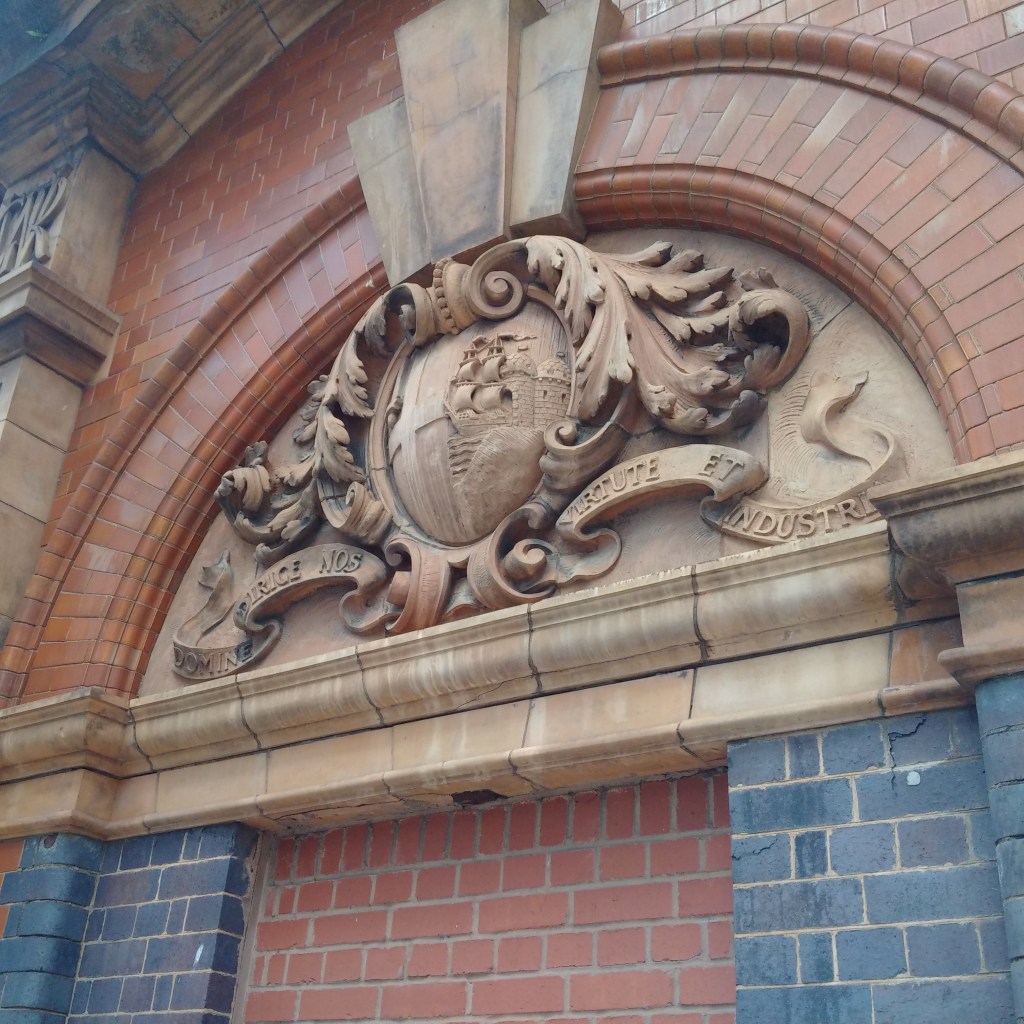
Wonderful, isn’t it? Very neat brickwork, detailing, coats of arms, interesting but not overwhelming shapes and colours. Truly, a superb little gem in the middle of Birmingham. Unfortunately, this lovely piece is somewhat overlooked due to its surroundings…
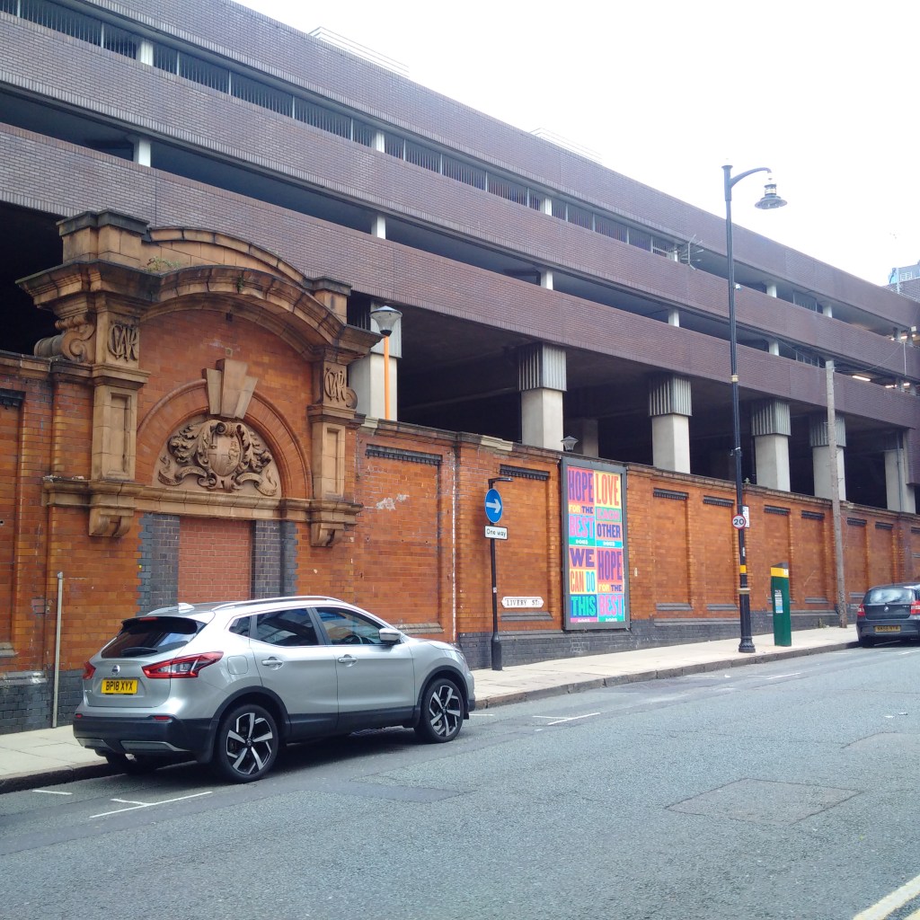
Yes, ladies and gentlemen, this is one of the walls enclosing Snow Hill railway station. This place is the tragedy of (at least some aspects of) modernity in microcosm.
Snow Hill station can trace its roots back all the way to the 1850s, when it was built by the Great Western Railway company as a temporary wooden structure, on the site of an old glassworks. It was rebuilt several times over the years; the most significant of these rebuilds took place between 1906 and 1912. This rebuild was designed to allow the station to compare with New Street, the other large railway station in the city, and its grandeur and luxury was such that reportedly Harland & Wolffe, builders of the Titanic, were jealous of the first class waiting rooms.
The route the station served, from London Paddington, was in direct competition with the London North Western Railway’s route from London Euston, which went (and still in fact goes) to Birmingham New Street.
Snow Hill, however, was able to survive two world wars, and remained reasonably competitive well into the 1960s, by which point the world was beginning to catch up with the railways as a whole. Two factors would lead to the downfall of Snow Hill; Post World War 2, the Attlee government had nationalised the railways, but perhaps more importantly, a new, exciting form of transport was beginning to show itself; the car.
Cars had been around for quite some time, but by the 1960s they were faster, more reliable and, essentially, more affordable to buy and run than ever. Exciting new infrastructure in the form of motorways was springing up everywhere to provide for these new cars, and thus people were buying them in droves.
This was causing a drop in passenger numbers on the railways, not to mention freight volumes lost to modern, capable lorries. British Railways, as it was then, was struggling to catch up with the modern world, and hemorrhaging money in the process.
Into this melee stepped Dr Beeching. This is not the place for a detailed discussion of his career, but he felt that the way to fix the railways’ money problems was to economise. Where there had been two previously competing railways, he proposed, there should only be one. Why have two stations when one would do? After all, money could be put into improving the remaining one.
And so it was in Birmingham. Much of Snow Hill’s traffic was transferred to New Street or simply dispensed with altogether. Snow Hill was left to rot, its grand canopies now sheltering a car park.
It will surprise some readers to learn that this was not the real tragedy of the piece. Left to rot it may have been, but the buildings remained. Their heritage was not, at least in the early 1970s, completely lost. No, the real tragedy was that they wanted to have a railway station on the site.
Yes, you read that correctly. It was decided that the old station was subsiding, and that the car park needed to be kept, and therefore the old station needed to be demolished in order to make way for what we now see. That the new one could scarcely have been uglier, or that the passenger environment could scarcely have been less inviting, seemed to not be on the agenda.
If you are wondering about what happened to New Street, you are also in for a disappointment; the station was rebuilt in the 1960s, to a rather horrible but higher capacity concrete design, with the platforms all under concrete with little ventilation. The station has become more pleasant in recent years, but very little remains of the original.
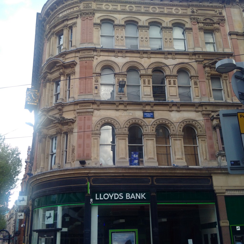
The case of Snow Hill is by no means unique; much of the Birmingham skyline has been transformed over the past 50 or so years. Fairly modest traditional buildings like this:
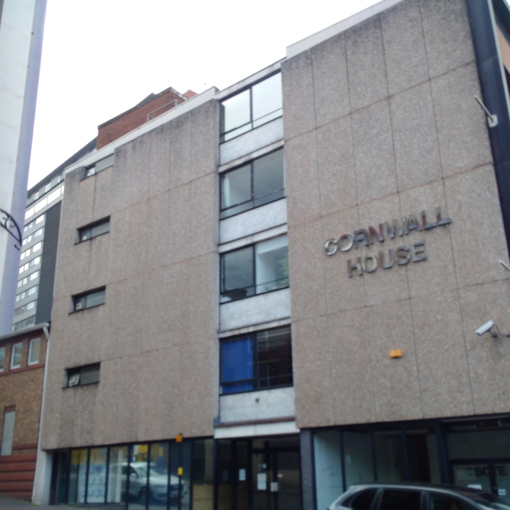
Have been replaced with this kind of thing…

That this is a downgrade is obvious. One other thing to appreciate is the vast gulf of asphalt road between where this photograph was taken and the building. This is yet another mistake that has ruined a lot of cities, replacing charming cobbles with plain black tarmac with large markings and road signs designed exclusively around cars, rather than the people actually in the city.
Other mistakes in Birmingham include this:
Large, unfriendly glass panels, small, grotty openings inexplicably on their own to the left, waterstained pebble dash… one can scarcely conceive an uglier building.
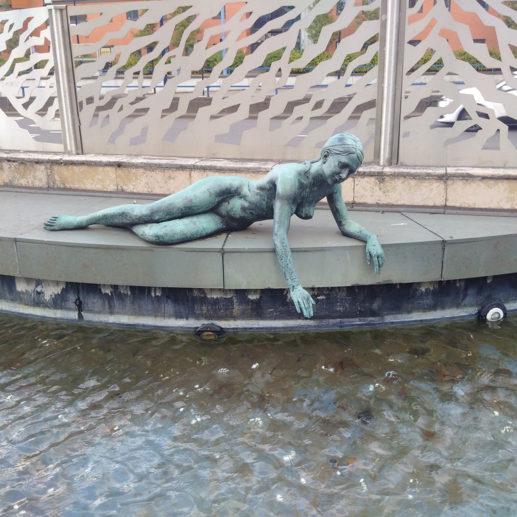
Not that they haven’t tried. This rather bizarre affair is actually in the possession of the Teenage Cancer Trust, a very worthy charity, but I do have to wonder just what the architect was smoking when he came up with this:

It seems even the statues despair at this monstrosity, as evidenced outside:
Some architects have tried to ape past styles, but do so in a modern way. These buildings really demonstrate the phrase “so near, and yet so far”. Let’s take a look at one.
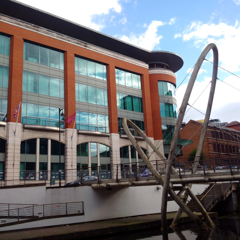
Forget for a minute the bizarre bridge over the canal in the foreground. It is also terrible, and completely out of keeping with the industrial heritage of the canals, but it is not the point of our discussion.
Well, you might say, this has some old building materials, a bit of brick here and there, and a few details, what is the problem?
Well, the first issue is the large, flat expanses of glass in between the brickwork. The natural light is good, but the rather blank reflection in them does little for the character of the building, not to mention being expensive, difficult to transport and fragile.
The other major issue is the brickwork itself. An attempt has been made to make it look traditional, but it looks wrong, and indeed you will see this on many buildings. This has to do with the way that the brickwork is put together, and the principal problem is the “bond” of the brickwork, or its arrangement.
You see, bricks have several faces. There is the shiner, the largest face, which is usually faced downwards, the header, which is the smallest face, on the end, and the stretcher, which is the other face.
Why is this relevant? In the old days, most buildings were single-brick, that is, there was only one wall. Therefore, this wall needed to be very strong as it alone had to hold up the building, and the brick “bond” must include some headers faced outwards alongside the stretchers. This type of construction is not without its problems, as it is quite a poor insulator both of heat and sound.
The more modern way of doing it is to build cavity walls, effectively two walls with a gap in between. This is a much better insulator, and it means that neither wall has to be as strong as the old ones. Therefore, it is possible to use a “stretcher” bond, just made up of stretchers facing outwards, which, while weaker, saves bricks.
It is, however, one reason why modern brickwork never looks quite correct, coupled with thicker modern mortars. One other problem with modern bricks is that they are often made to look “rustic” by printing patterns into the brick, but in reality if you look at the wall you’ll notice the supposedly random patterns repeat and the illusion falls apart. Suffice to say, these walls do not actually fit in and look hopelessly generic.
Perhaps I am after all an old fashioned sort of chap. Perhaps I am just resisting “progress” or some such. In any case, dear reader, I do hope I have made some decent points, and I do hope you enjoyed this rather rambling explanation of my opinion.

Leave a comment